Vividz Graphics
- Thread starter TaintedSoldiers
- Start date
You are using an out of date browser. It may not display this or other websites correctly.
You should upgrade or use an alternative browser.
You should upgrade or use an alternative browser.

")
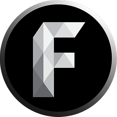
The Text needs some work, but i like the logo. But, also the logo isn't symmetric on both sides.
Its a good design for your quality but just practice more and you'll get better.
Its a good design for your quality but just practice more and you'll get better.
Logo was not meant to be symmetric.The Text needs some work, but i like the logo. But, also the logo isn't symmetric on both sides.
Its a good design for your quality but just practice more and you'll get better.
Logo is real nice. Good use of lighting and layering to visualize depth.
The typography here is really bad though. Nothing about black text or white outline fits in this image, and the fact that Vividz is way shorter than Graphics makes the whole banner feel uneven. I suggest moving both words to the right side of the logo and just completely rethinking the font you're using and the visual style you're applying to it and how you're gonna make it both legible and fit aesthetically to the background and logo.
The typography here is really bad though. Nothing about black text or white outline fits in this image, and the fact that Vividz is way shorter than Graphics makes the whole banner feel uneven. I suggest moving both words to the right side of the logo and just completely rethinking the font you're using and the visual style you're applying to it and how you're gonna make it both legible and fit aesthetically to the background and logo.